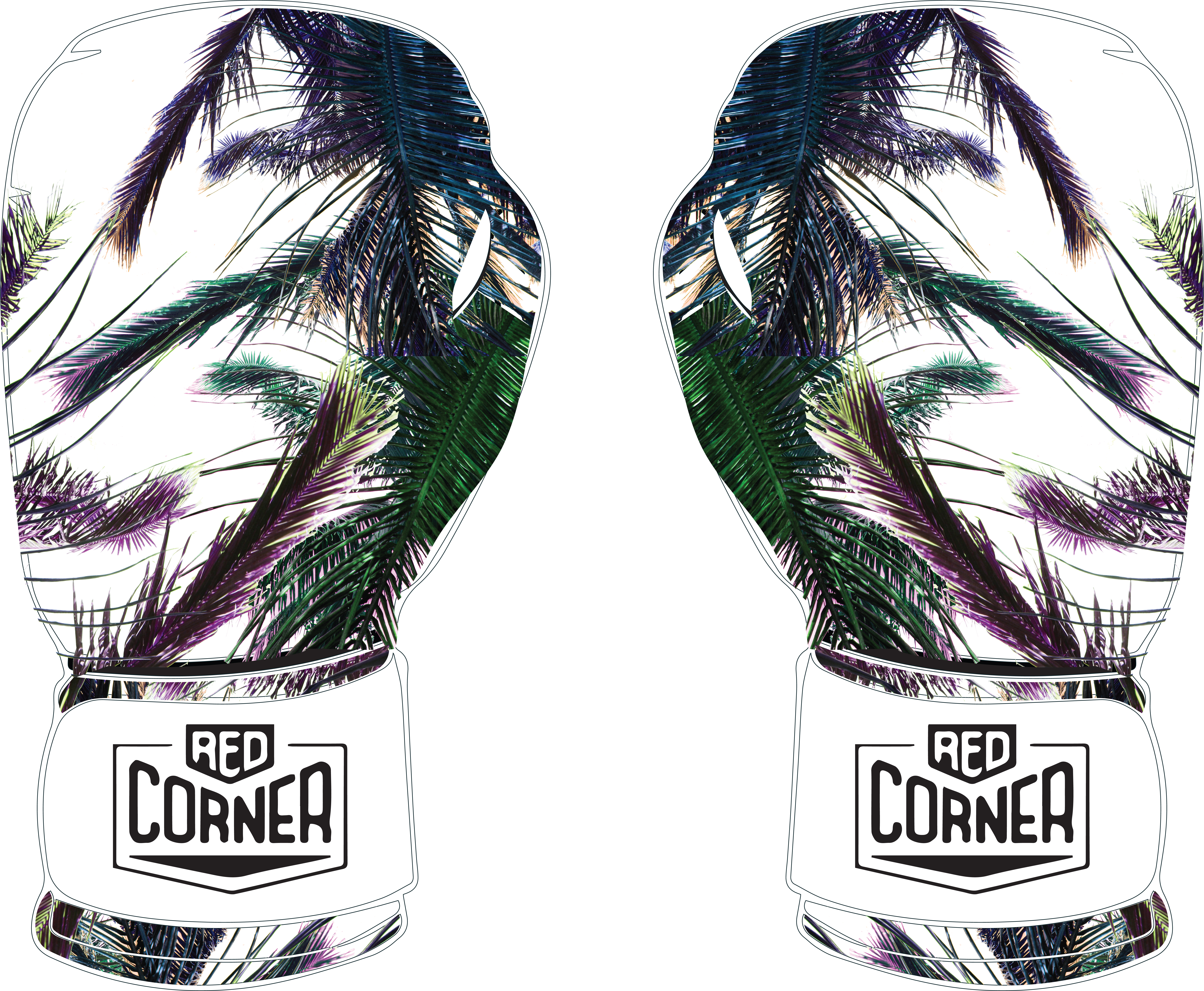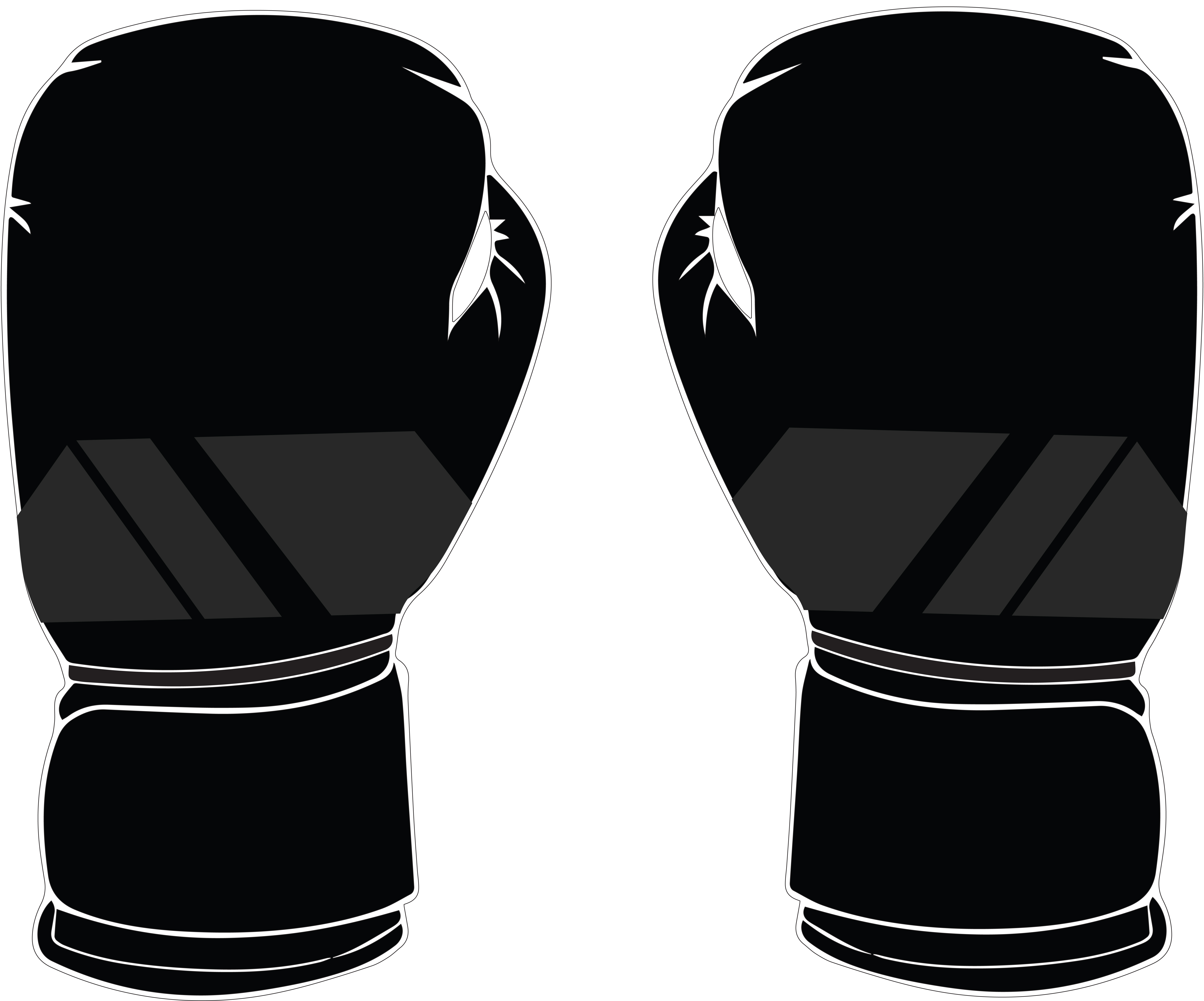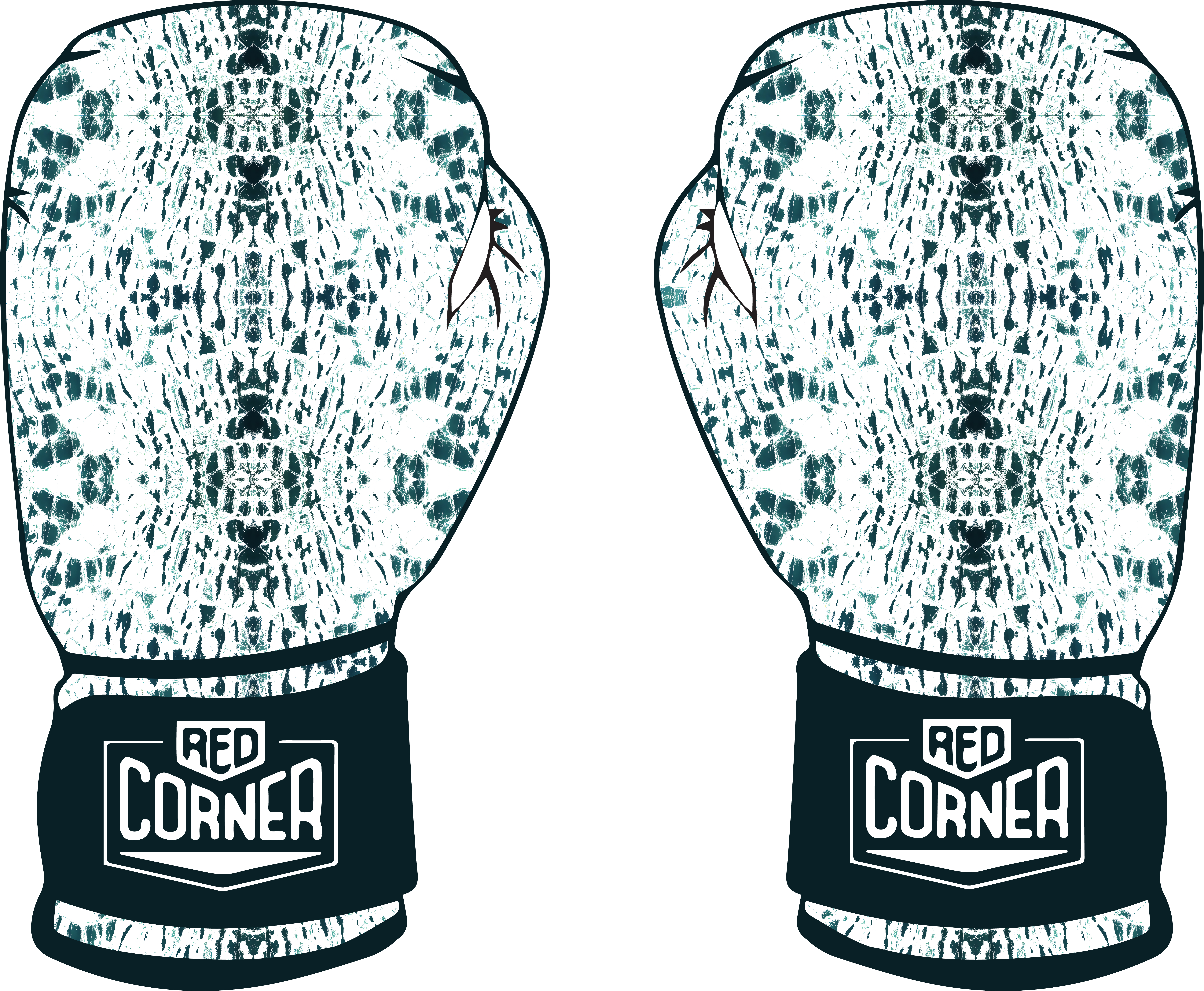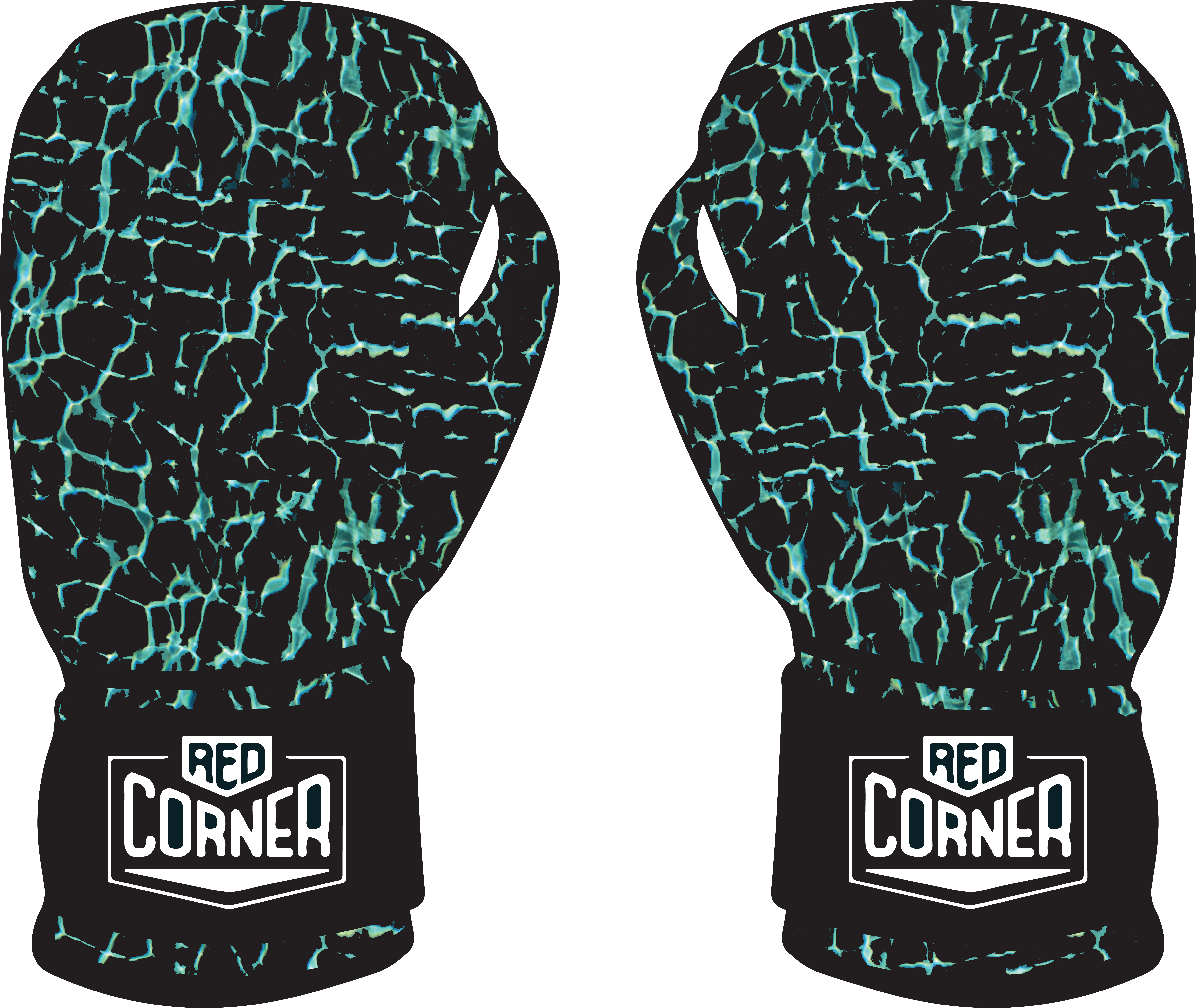
Red Corner Boxing (RCB) as a company has three core beliefs; reliability, empowerment through individuality and credibility with customers. Along with these core ideals, RCB has a distinct brand personality that is fashionable, inspirational, passionate, original, genuine, and most importantly a great fit.
As the company evolves, the more focus they are putting on being innovative and forward thinking. With the aim to broaden the interest of boxing to women, their products intend to break down stereotypes around the sport by making boxing an acceptable fitness activity for both men and women. They have optimised their originality as a brand by selling products that are fun, exciting, empowering and customisable with a strong fashion appeal.
They wish to continue this journey of innovation by building on their current range of products to suit a modern fitness consumer.
This brief specifically asked for a new symbol design that incorporated a corner design element into it. The idea behind the symbol was for the company to be able to display it without needed the full logo, and for people to be able to recognise it. Similar to the way the Nike 'Tick' can be recognised as belonging to the complete brand.
Along with the symbol design, the company asked for new designs for their Core series, and their Silver Label Series.


